Cred-data
"From transactions to decisions."
The business had transaction and spend data locked in raw form, with no easy way to see which spend categories were driving volume or how spend broke down by issuer bank.
What it looked like.
How to read this case study: what I owned, what shipped and the verified outcome (My Role, What Shipped and Impact below) are factual. The surrounding strategy, vision, alternatives and metrics framework are interview-ready framing built on those facts, how I'd talk through the product thinking, not a claim that every metric or GTM motion was formally run at the time.
Challenges & baseline.
Challenges
Raw transaction data on its own doesn't answer "where is spend concentrated" or "which bank is driving volume", someone had to manually pull and cross-reference it every reporting cycle. Data availability isn't the same as decision availability, raw records had to become questions executives could actually answer.
Baseline
Reporting process before this dashboard: manual data pulls per period.
What the customer actually needed.
Insight
A single number rarely tells the full story, transaction count and unique-user count look similar until you need to know whether volume is broad across many customers or concentrated among a few repeat spenders. The real product work happened before a single chart was built: defining the keyword taxonomy (Hospital, Medical, Dental, Laboratory) that turns raw merchant activity into categories a decision-maker actually recognises.
Job to be done
When I need to answer a spend or category question, let me get a trusted answer from the dashboard directly, instead of requesting a fresh manual data pull.
Vision, mission & the bets we made.
Every important business question answerable without another manual data pull.
Turn keyword-tagged transaction data into decision-ready intelligence.
Make the highest-spend category visible at a glance; show transaction count alongside unique users, not just totals; break spend down by issuer bank for the same period.
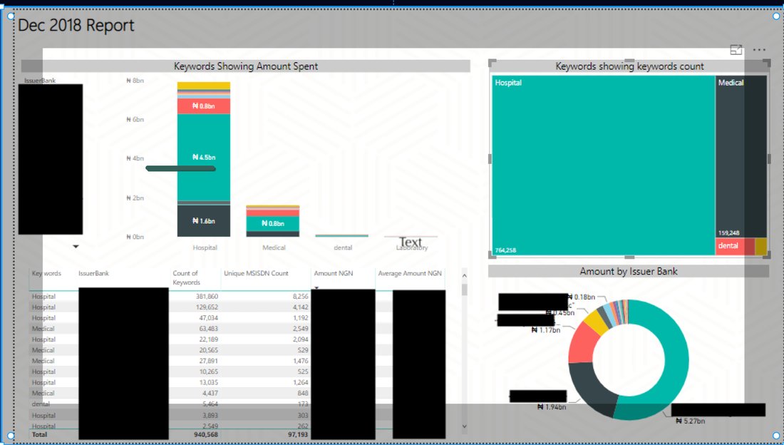
Ship a spend-by-category chart; ship a keyword-count treemap for volume at a glance; ship an issuer-bank breakdown; ship a searchable data table with count, unique user and amount columns.
Strategic bets
- Tag transactions by keyword (Hospital, Medical, Dental, Laboratory) so spend maps to real-world categories, not just merchant codes
- Show unique user count next to transaction count, since one number alone hides whether volume is many users or a few repeat ones
- Keep the report to one screen, chart, treemap and table together, so nothing requires a second report to cross-reference
Alternatives considered
The faster path was to visualise the raw data as-is, ship charts sooner, skip the taxonomy work. That was rejected because untagged transaction data doesn't map to categories anyone can reason about, the chart would look finished but not actually answer the business question. Defining the keyword taxonomy first, before touching a single visual, is what made the eventual report trustworthy instead of just colourful.
What I owned.
Product Manager / analytics owner, defined the keyword taxonomy and the report structure end to end.
What shipped.
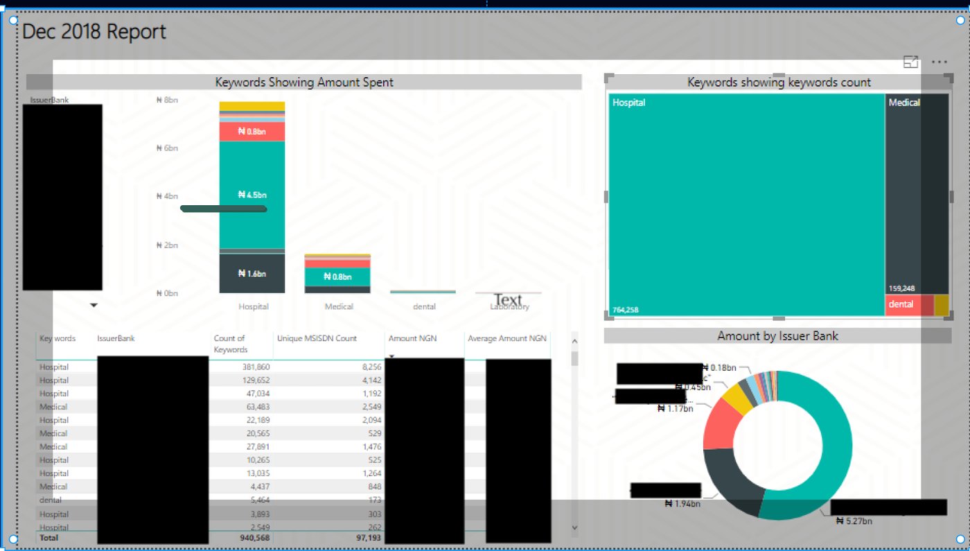
One report shows category spend (bar chart), transaction volume by keyword (treemap), and bank-level breakdown (donut chart), backed by a searchable table totalling 940,568 keyword matches across 97,193 unique users in the sample period, with Hospital the leading category at ₦4.5bn.
How it got built.
Defined the keyword taxonomy (Hospital, Medical, Dental, Laboratory) to tag raw transactions
Built the spend-by-category and keyword-count visuals in Power BI
Added the issuer-bank breakdown and the searchable detail table
Packaged it as a repeatable monthly report format
How this reaches customers.
Internal adoption motion rather than external GTM: replace the standing manual reporting request with a self-service report stakeholders open directly, success here looks like fewer ad hoc data-pull requests landing on the team, not acquisition or pricing.
North star metric.
Supporting metrics
- Recommended North Star going forward: time from business question to trusted answer, not report volume alone
- Manual reporting hours displaced
- Report adoption and monthly active users
- Number of recurring reports automated
Guardrails
- Data freshness and completeness
- Query/report turnaround time
The verified bottom line.
Replaced a manual, once-a-period data pull with a report that reads itself, category, volume and bank breakdown all visible without a fresh export.
What I'd do differently.
A single number rarely tells the full story, transaction count and unique-user count look similar until you need to know whether volume is broad or concentrated among a few repeat spenders. Building the keyword taxonomy first, before touching a single chart, is what made the rest of the report trustworthy instead of just colourful.
More proof, more products.
See every product shipped and business built.